Run Chart in Six Sigma (Simple Practical Guide)
Learn Run Chart in Six Sigma with examples, rules, and step-by-step guide to detect trends and improve process performance easily.
🚀 Introduction: When Data Speaks, Are You Listening?
A few months back, during a project review, we noticed something strange. The output of a system was fluctuating — but not randomly.
Some days it was consistently high. Some days consistently low.
At first glance, everything looked normal. But when we plotted a simple Run Chart in Six Sigma, the real story came out.
👉 There was a pattern. And patterns always mean something.
Simple words mein:
“Data kabhi jhooth nahi bolta… bas usko sahi tareeke se dekhna aana chahiye.”
Let’s understand this powerful yet underrated tool.
📊 What is a Run Chart in Six Sigma?
A Run Chart is a simple line graph that shows data points plotted over time.
👉 It helps you identify:
- Trends (increasing or decreasing)
- Shifts (sudden changes)
- Cycles or patterns
Unlike complex statistical tools, this one is super easy.
💡 Think of it like your ECG report — it shows how your process behaves over time.
🎯 Why Run Chart is Important?
In Six Sigma, the goal is to reduce variation and improve consistency.
Run Chart helps you:
✔ Understand process behavior
✔ Detect early warning signs
✔ Identify non-random patterns
✔ Make data-driven decisions
👉 Without it, you are just guessing.
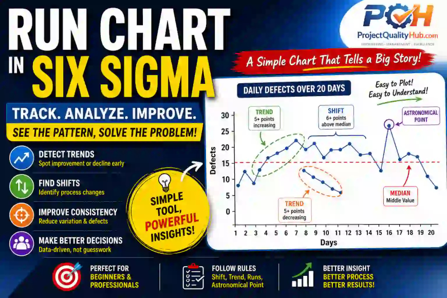
🔍 Key Elements of a Run Chart
1. Data Points
Collected over time (daily, weekly, hourly)
2. Time Axis (X-axis)
Shows sequence or timeline
3. Value Axis (Y-axis)
Represents measurement (temperature, output, defects, etc.)
4. Median Line
Middle value of data (not average)
👉 Important for identifying patterns
📏 Run Chart Rules (Very Important)
This is where real analysis happens.
🔹 1. Shift
6 or more consecutive points above or below median
👉 Indicates process change
🔹 2. Trend
5 or more consecutive increasing or decreasing points
👉 Something is improving or deteriorating
🔹 3. Runs
Number of times data crosses the median
Too many or too few = non-random behavior
🔹 4. Astronomical Data Point
Unusually high or low value
👉 Possible abnormal event
🏭 Practical Example (From Site Experience)
📌 Problem:
Daily production output was inconsistent.
📊 Action:
We plotted a Run Chart for 15 days.
🔍 Observation:
- 7 consecutive days above median → Shift detected
- Then sudden drop → Possible external factor
🎯 Root Cause:
Shift change + manpower variation
👉 Without Run Chart, we would never catch this.
🛠️ Step-by-Step: How to Create a Run Chart
Step 1: Collect Data
Example: Daily output, defect count, temperature
Step 2: Arrange in Time Order
Sequence is very important
Step 3: Calculate Median
Middle value (not average)
Step 4: Plot Graph
X-axis → Time
Y-axis → Value
Step 5: Draw Median Line
Step 6: Apply Run Chart Rules
Check for:
- Shifts
- Trends
- Runs
- Outliers
Step 7: Take Action
Fix process, not just data
📈 Run Chart vs Control Chart (Quick Difference)
| Feature | Run Chart | Control Chart |
|---|---|---|
| Complexity | Simple | Advanced |
| Control Limits | ❌ No | ✅ Yes |
| Usage | Initial analysis | Detailed monitoring |
| Skill Level | Beginner | Intermediate/Expert |
👉 Start with Run Chart, then move to Control Chart.
✅ Advantages of Run Chart
✔ Very easy to create
✔ No statistical software needed
✔ Quick insights
✔ Helps in early problem detection
✔ Great for beginners
❌ Limitations of Run Chart
⚠ No control limits
⚠ Less precise than control chart
⚠ Misinterpretation possible
⚠ Depends on correct data
🚫 Common Mistakes
1. Using Average Instead of Median
Big mistake — affects analysis
2. Ignoring Data Sequence
Time order is critical
3. Overreacting to Single Data Point
One point ≠ trend
4. Not Applying Rules
Graph banaya, analysis nahi kiya
5. Poor Data Quality
Garbage in = garbage out
💡 Expert Tips (From Real Projects)
👉 Always collect reliable data
👉 Combine with 5 Why Analysis for root cause
👉 Review charts in team meetings
👉 Use Excel for quick plotting
👉 Don’t overcomplicate — keep it simple
Ek golden rule:
👉 “If you can’t visualize it, you can’t improve it.”
🔥 Conclusion: Simple Chart, Powerful Insights
Run Chart in Six Sigma is one of the simplest tools — but don’t underestimate it.
It gives you clarity.
It shows patterns.
It helps you take better decisions.
Next time when your process feels unstable…
👉 Don’t guess — plot a Run Chart
You’ll be surprised what your data reveals.
❓ FAQs
1. What is Run Chart in Six Sigma?
A Run Chart is a line graph that shows data over time to identify trends and patterns.
2. What is the difference between Run Chart and Control Chart?
Run Chart is simple and has no control limits, while Control Chart includes statistical limits.
3. Why median is used in Run Chart?
Median reduces the effect of extreme values and gives better pattern detection.
4. How many data points are needed?
Minimum 10–12 data points recommended for meaningful analysis.
5. Can Run Chart detect root cause?
No. It shows patterns. Combine with tools like 5 Why for root cause.
6. Is Run Chart useful for beginners?
Yes. It’s one of the easiest Six Sigma tools to start with.
Related Articles
- Lean Six Sigma White Belt: Beginner Guide
- Six Sigma DMAIC Model Explained in Simple words
- SIPOC Diagram in Six Sigma Explained Simply
- Check Sheet in Six Sigma Explained with Examples
- Histogram in Six Sigma: Simple Tool, Powerful Insights
- Pareto Chart in Six Sigma: Fix 80% Problems Fast
- 5 Why Analysis in Six Sigma (Simple Practical Guide)