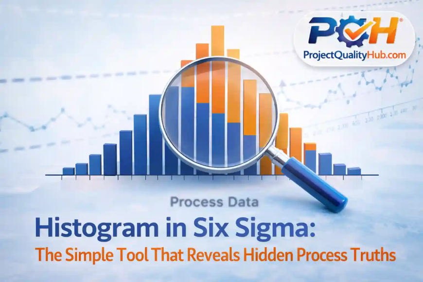
Histogram in Six Sigma: Simple Tool, Powerful Insights
Learn Histogram in Six Sigma with examples, steps & expert tips. Improve process quality and understand data variation easily.
Introduction: When Data Speaks Clearly
A few months ago, I was analyzing a descaling system issue at a plant. All readings looked “okay” on average—but performance was still dropping.
Then I plotted a histogram.
Suddenly, everything made sense.
The problem wasn’t the average—it was the variation.
👉 Yahi jagah hai jahan Histogram in Six Sigma apni real power dikhata hai.
If you rely only on averages, you’re seeing just half the story. A histogram shows the full picture—spread, pattern, and hidden problems.
📊 What is Histogram in Six Sigma?
A histogram is a graphical tool that displays data in the form of bars.
In simple terms:
👉 It shows how often different values occur in a dataset
In Six Sigma, histograms are used to:
- Understand process variation
- Identify data distribution
- Check whether a process is stable
💡 Simple language me bole toh: histogram ek aisa visual tool hai jo data ki kahani instantly samjha deta hai.
🎯 Why Histogram is Important in Six Sigma
The main goal of Six Sigma is to reduce defects and improve process quality.
Histogram helps in:
- Identifying variation
- Detecting outliers
- Understanding process behavior
- Supporting better decision-making
👉 Agar aap data ko visually nahi dekhte, toh aap bahut kuch miss kar rahe ho.
📈 Key Components of a Histogram
Let’s break it down:
- X-axis → Data range (e.g., pressure, thickness, flow rate)
- Y-axis → Frequency (how often values occur)
- Bars → Represent distribution
👉 Simple hai: jitni baar value repeat hogi, utna hi bar bada dikhega.
📊 Types of Histogram Patterns (Very Important)
A histogram is not just a chart—it tells a story.
1. Normal Distribution (Bell Shape)
- Indicates a stable and predictable process
👉 Ye ideal condition hoti hai Six Sigma me
2. Skewed Distribution
- Data tilted to one side
👉 Matlab process me imbalance hai
3. Bimodal Distribution
- Two peaks
👉 Ho sakta hai do alag process ya operators involved ho
4. Uniform Distribution
- Flat pattern
👉 Control missing ya randomness zyada hai
🛠️ Real-Life Example (From Industry Experience)
Case: Descaling Pump Flow Issue
Problem:
- Required flow: 600 LPM
- Output fluctuating
What We Did:
Collected around 50 readings and plotted a histogram.
What We Found:
- Most values were between 520–550 LPM
- Very few readings reached 600 LPM
👉 Yahan clear ho gaya ki issue average ka nahi, consistency ka hai.
Solution:
- Installed booster pump
- Removed pipeline restrictions
📌 Lesson:
A histogram reveals what raw data often hides.
🧭 Step-by-Step: How to Create a Histogram
Step 1: Collect Data
Take at least 30–50 observations
Step 2: Identify Range
Max value – Min value
Step 3: Decide Bins
Divide data into 5–10 groups
Step 4: Calculate Frequency
Count how many values fall in each group
Step 5: Plot Graph
Use Excel, Minitab, or Python
👉 Excel me “Insert → Histogram” option use karke easily bana sakte ho.
✅ Advantages of Histogram in Six Sigma
✔ Easy to understand
✔ Provides clear visualization
✔ Helps identify variation
✔ Supports quick decisions
✔ Useful in root cause analysis
❌ Disadvantages
❌ Does not show exact values
❌ Wrong bin size can mislead
❌ Cannot show time trends
👉 Agar bins galat choose kiye, toh interpretation bhi galat ho sakta hai.
⚠️ Common Mistakes (Avoid These)
❌ Ignoring histogram and relying only on average
❌ Using too little data
❌ Choosing incorrect bin size
❌ Not analyzing the pattern
👉 Data dekhna easy hai, lekin samajhna skill hai.
🚀 Expert Tips (From Real Experience)
✔ Always use histogram with control charts
✔ Don’t ignore outliers—they are clues
✔ Compare histograms across shifts or machines
✔ Discuss results with your team
💡 Pro Tip: Agar histogram normal nahi hai, toh process bhi stable nahi hai.
🧠 Conclusion: Small Tool, Big Impact
Histogram in Six Sigma may look simple, but it’s incredibly powerful.
Whether you are:
- A student
- An engineer
- A quality professional
👉 This tool can completely change how you understand data.
Because:
“If you understand variation, you can control the process.”
Aur jab process control me hota hai:
- defects kam hote hain
- quality improve hoti hai
- cost reduce hoti hai
❓ FAQs (Frequently Asked Questions)
1. What is Histogram in Six Sigma?
It is a graphical tool used to understand data distribution and process variation.
2. Why is histogram important?
It helps identify variation, outliers, and process behavior.
3. What is the ideal histogram shape?
A normal (bell-shaped) distribution.
4. How much data is required?
At least 30 observations are recommended.
5. Which tools can be used to create histograms?
Excel, Minitab, Python, and Power BI.
Related Articles
- Six Sigma Certification Guide: Levels, Benefits & Career
- Top Certification Courses for Quality Engineers in India (2026)
- Lean Six Sigma White Belt: Beginner Guide
- Six Sigma DMAIC Model Explained in Simple words
- SIPOC Diagram in Six Sigma Explained Simply
- Check Sheet in Six Sigma Explained with Examples