Primavera P6 View Menu Explained: Complete Beginner Guide - Chapter 3
Learn the Primavera P6 View Menu (Alt+V) step by step. Understand layouts, filters, columns, bars, critical path views, and schedule visualization.
Primavera P6 View Menu (Alt+V) Explained – Tutorial Chapter 3
Introduction
After learning the File Menu and Edit Menu, the next important menu every planning engineer should master is the View Menu (Alt+V).
In real projects, creating a schedule is only half the job. The other half is presenting the schedule in a way that project managers, clients, consultants, and site teams can easily understand.
This is where the Primavera P6 View Menu becomes extremely valuable.
The View Menu controls how project information is displayed on your screen. Whether you want to show only critical activities, customize Gantt charts, add new columns, highlight delayed work, or create management-friendly layouts, almost everything is controlled through the View Menu.
As a planning engineer working in steel plant projects, shutdowns, mechanical erection, commissioning, and EPC projects, I use View Menu options every day. In many cases, the difference between a professional schedule and a confusing schedule is simply how well the View Menu has been configured.
Use of View Menu in Primavera P6
The View Menu is primarily used to customize how project information appears on the screen.
Access it through:
View → Alt + VThe View Menu helps users:
- Create layouts
- Customize Gantt charts
- Filter activities
- Change displayed columns
- Modify timescales
- Highlight critical paths
- Display progress lines
- Organize schedule views
Think of it as the "Display Control Center" of Primavera P6.
Without the View Menu, even a perfectly developed schedule can become difficult to understand.
Why the View Menu is Important in Project Planning
A project schedule may contain:
- 500 activities
- 5,000 activities
- 50,000 activities
Showing all activities simultaneously creates confusion.
Different stakeholders require different views:
Project Manager
Needs:
- Critical path
- Milestones
- Project completion date
Site Engineer
Needs:
- Current month activities
- Area-wise activities
- Resource requirements
Client
Needs:
- High-level summary
- Major milestones
- Progress status
Planning Engineer
Needs:
- Float values
- Logic relationships
- Critical activities
The View Menu allows each stakeholder to see only the information relevant to them.
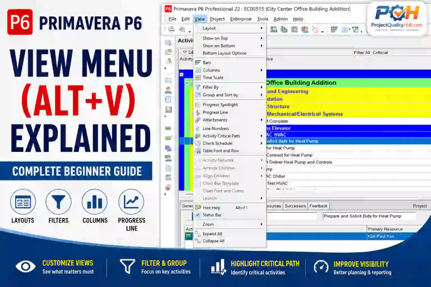
Major Options Available in Primavera P6 View Menu
The View Menu contains several important functions:
- Layout
- Show on Top
- Show on Bottom
- Bottom Layout Options
- Bars
- Columns
- Time Scale
- Filter By
- Group and Sort By
- Progress Spotlight
- Progress Line
- Attachments
- Line Numbers
- Activity Critical Path
- Check Schedule
- Table Font and Row
- Zoom
- Expand All
- Collapse All
Let's understand each option practically.
Layout
Purpose
A Layout controls how project information is displayed.
Practical Example
You may create separate layouts for:
- Client Reporting
- Weekly Progress Review
- Shutdown Planning
- Resource Monitoring
Real-Life Use
In a steel plant project, management may want a milestone-only layout while site engineers need detailed activity layouts.
Instead of changing settings repeatedly, create different layouts and switch between them instantly.
Professional Tip
Always save custom layouts with meaningful names:
Monthly Progress Layout
Critical Path Layout
Client Review Layout
Show on Top
Purpose
Displays selected details at the top section of the screen.
Practical Use
Useful when reviewing:
- Activity Details
- Resource Assignments
- Relationships
on large monitors.
Show on Bottom
Purpose
Displays details in the bottom pane.
Practical Application
Most planners prefer:
Activities Table
Gantt Chart
Activity Details
in the bottom section.
This allows quick access to predecessor and successor information.
Bottom Layout Options
Purpose
Controls what information appears in the bottom layout.
Common Options
- General
- Status
- Resources
- Expenses
- Relationships
- Notebook
- Codes
Practical Benefit
Reduces screen clutter and improves productivity.
Bars
Purpose
Customizes the appearance of Gantt chart bars.
Controls
- Colors
- Shapes
- Critical activities
- Baseline bars
- Actual progress bars
Practical Example
Display:
- Critical Activities = Red
- Non-Critical Activities = Blue
- Completed Activities = Green
This instantly improves schedule readability.
Professional Tip
Use company-standard bar colors for reporting consistency.
Columns
Purpose
Controls which fields appear in the activity table.
Common Columns
- Activity ID
- Activity Name
- Start Date
- Finish Date
- Duration
- Total Float
- Percent Complete
Real Project Example
For delay analysis, add:
Total Float
Free Float
Remaining Duration
For progress reporting:
Percent Complete
Actual Start
Actual Finish
Why Important
The right columns help planners analyze schedules much faster.
Time Scale
Purpose
Controls the timeline shown in the Gantt chart.
Available Views
- Hours
- Days
- Weeks
- Months
- Quarters
- Years
Practical Example
Shutdown Schedule:
Hours
Days
Building Construction:
Weeks
Months
Mega Steel Plant Project:
Months
Quarters
Professional Tip
Always choose a timescale appropriate to project duration.
Filter By
Purpose
Displays only selected activities.
Common Filters
- Critical Activities
- In Progress Activities
- Completed Activities
- Activities Starting This Month
Practical Example
Before a weekly review meeting, show:
Activities Starting Next 14 Daysinstead of displaying 5,000 activities.
Major Benefit
Improves schedule review efficiency.
Group and Sort By
Purpose
Organizes activities into logical categories.
Grouping Options
- WBS
- Area
- Responsible Manager
- Activity Code
- Resource
Example
Mechanical Erection Project:
Area-1
Area-2
Area-3
Activities are automatically grouped by area.
Professional Advantage
Creates cleaner reports.
Progress Spotlight
Purpose
Highlights activities occurring within a selected time period.
Practical Use
Suppose today's date is:
01-July-2026You want to review work planned during the next 30 days.
Progress Spotlight highlights those activities automatically.
Best Use
Short-term planning.
Progress Line
Purpose
Graphically displays project progress against planned schedule.
Practical Example
A project should be 60% complete.
Actual progress is only 45%.
The Progress Line immediately highlights delays.
Why Project Managers Love It
Provides quick visual understanding of schedule health.
Attachments
Purpose
Displays attached documents.
Examples
- Drawings
- Method Statements
- Inspection Reports
- Vendor Documents
Practical Use
Link drawings directly to activities.
Example:
Pump Installation Activity
Attached Drawing No. HPDS-P-101
Line Numbers
Purpose
Displays row numbers in activity tables.
Benefit
Improves schedule navigation during reviews.
Activity Critical Path
Purpose
Highlights the project's critical path.
Why Important
Critical activities directly affect project completion.
Any delay in these activities delays the entire project.
Practical Example
HPDS Installation Project:
Critical Path:
Foundation
Grouting
Pump Installation
Hydro Testing
Commissioning
The View Menu can highlight these activities instantly.
Check Schedule
Purpose
Displays schedule quality checks.
Helps Identify
- Missing relationships
- Open ends
- Constraints
- Logic issues
Best Practice
Run schedule checks before client submissions.
Table Font and Row
Purpose
Changes table appearance.
Options
- Font size
- Row height
- Text style
Benefit
Improves readability during presentations.
Zoom
Purpose
Changes Gantt chart zoom level.
Options
- Zoom In
- Zoom Out
- Entire Project
Practical Use
During executive meetings, zoom out for overall project visibility.
Expand All
Purpose
Expands all WBS levels.
Useful When
Reviewing complete project details.
Collapse All
Purpose
Collapses all WBS levels.
Useful When
Presenting high-level summaries.
Practical Example from a Steel Plant Project
Consider a High Pressure Descaling Unit (HPDS) installation project.
Project Contains
- 850 Activities
- 12 WBS Levels
- Multiple Contractors
Before the weekly review meeting:
Planning Engineer Uses
Filter By
- Next 30 Days Activities
Group and Sort
- By Mechanical Area
Columns
- Start
- Finish
- Percent Complete
Progress Line
- Review delays
Activity Critical Path
- Highlight critical activities
Within minutes, a highly professional review layout is ready.
Best Practices for Using the View Menu
Create Multiple Layouts
Separate layouts for:
- Management
- Client
- Site Team
Keep Columns Relevant
Avoid showing unnecessary fields.
Use Filters Frequently
Review smaller, focused activity groups.
Highlight Critical Activities
Makes delay analysis easier.
Save Layouts Regularly
Prevents rework.
Common Mistakes Beginners Make
Using Default Layout Only
Creates cluttered schedules.
Displaying Too Many Columns
Reduces readability.
Ignoring Critical Path Display
Makes schedule reviews difficult.
Wrong Timescale Selection
Can hide important project details.
Not Saving Layouts
Results in repeated customization work.
Conclusion
The Primavera P6 View Menu is one of the most powerful tools available to planning engineers. While the schedule contains the data, the View Menu controls how effectively that data is presented and analyzed.
Whether you are preparing a client report, conducting a delay analysis, monitoring critical activities, or managing a steel plant shutdown project, the View Menu helps transform raw schedule data into meaningful project information.
For beginners, mastering the View Menu is one of the fastest ways to improve productivity and become comfortable with Primavera P6.
Frequently Asked Questions (FAQ)
What is the shortcut key for the View Menu in Primavera P6?
The shortcut key is Alt + V.
What is the purpose of Layouts in Primavera P6?
Layouts allow users to save customized schedule views for different reporting and analysis requirements.
Which View Menu option is used to display only critical activities?
Use Filter By → Critical Activities.
What is the use of Progress Line?
Progress Line graphically compares actual progress against planned progress.
Why is Group and Sort important?
It organizes activities into logical categories, making schedules easier to review and analyze.
What does Activity Critical Path do?
It highlights activities that directly impact project completion dates.